
U-Stop Convenience Shop
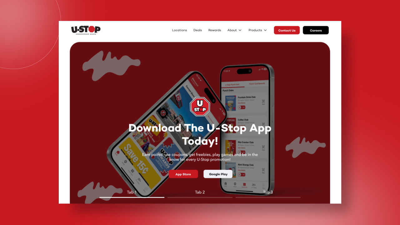
A Neighborhood Staple, Reintroduced for a Digital Generation
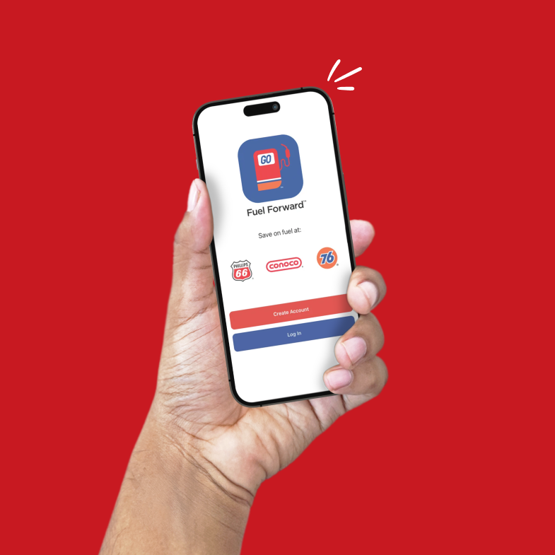
U-Stop has been a fixture in Lincoln, Nebraska for over 60 years. 39 locations, a genuinely loyal customer base, and a community program (Kick It Back) that donates to local organizations every single month. But when I started on this project at Redthread in 2024, the existing site didn't reflect any of that personality or scale. It was hard to find a location, confusing to understand the rewards ecosystem, and completely disconnected from the Fuel Forward app that customers were actually using day to day.
The assignment was broad but the priority was clear. Make the website feel as welcoming, well-stocked, and easy to navigate as the stores themselves.
My role was leading the UX and visual design from discovery through launch, shaping the site architecture, the locations experience, the loyalty storytelling, and the visual system that ties it all together. The result is a site that has pulled in over 50,000 active users since launch, with organic search sitting as the number one traffic channel. For a regional convenience chain, those are the kind of numbers that change how a business thinks about its digital front door.
39 Locations, Two Apps, One Rewards Program, and a Community Story to Tell
The biggest challenge on U-Stop wasn't any single page. It was the ecosystem. Customers come to U-Stop for different reasons (fuel, food, rewards, deals, community), and the old site treated each of those as separate, equally weighted silos. The result was a homepage that didn't prioritize anything, so visitors didn't either.
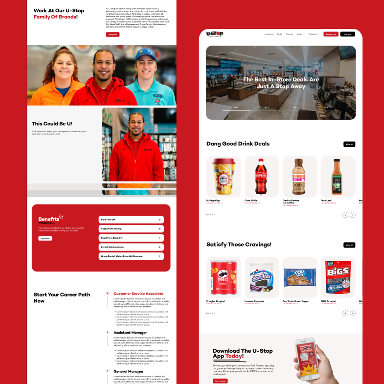
I restructured the site around the three most-trafficked actions: finding a location, understanding rewards, and downloading the app. Everything else became supporting content. The Locations page specifically was a heavy lift. With 39 stores across Lincoln and the surrounding areas, we needed a map experience that felt fast and scannable, not like a phone book. We evaluated multiple integration approaches before landing on one that balanced speed, search, and a clean mobile experience. That page alone has since pulled in 14,000 views, validating the decision to treat it as a core product feature rather than a footer link.
The second challenge was telling the loyalty story without overwhelming new visitors. Drive Savvy Rewards, Fuel Forward, points, cash, cents-per-gallon savings, donation dollars, sweepstakes, and U-Play Arcade. It's a genuinely generous program, but the early drafts made it read like a pricing page for an enterprise SaaS company. I worked closely with Redthread's team and the U-Stop leadership to strip it back to a layered disclosure pattern. Show the benefit first, let the mechanics unfold as people opt in.
What This Project Sharpened
Designing for a multi-location, multi-product brand taught me how to prioritize ruthlessly without losing personality.
Prioritization as a Design Tool
The old site had everything on it. The new site has the right things in the right places. That reframing (from "what can we fit" to "what does the user actually need first") changed how I approach every homepage now. Good design isn't adding features. It's knowing what to cut. The homepage has since become the single highest-trafficked page on the site with 38,000 views, proof that clarity converts.
Locations as a Product, Not a Page
For a 39-store chain, the Locations experience isn't a footer link. It's a core product feature. I designed it to work like a tool: fast filtering, clear hours, amenity tags, and a layout that stays usable on a phone at 5 a.m. when someone's just trying to find the closest open pump. It's now the second most-visited page on the entire site.
Brand Personality at Every Touchpoint
U-Stop's brand isn't corporate. It's neighborly, community-forward, and a little bit fun. I pushed to keep that energy alive in small moments across the site: the Kick It Back section, the rewards copy, the photography choices, the way the Fuel Forward app is introduced. The polish is there, but so is the personality.
Final design
The interface became a tool that disappeared into the work itself. Clean, purposeful, and genuinely useful.
The numbers tell the story of what changed
This was the project that taught me prioritization is a design decision, not a content decision. When a client has 60 years of stories, 39 locations, a loyalty program, an app, a community giveback initiative, and a customer base that spans three generations, the job isn't to put it all on the homepage. It's to earn the visitor's attention with the one thing they came for, then let everything else unfold from there. Watching the numbers come in after launch (50K active users, organic search leading acquisition, locations becoming the second-most-visited page) confirmed that the strategic calls we made at Redthread weren't just good design. They were good business.
Made for Impact
Explore projects that solve problems, delight users, and drive results.
Nebraska Farm Bureau
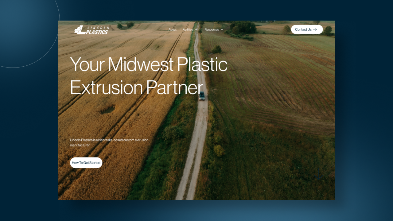
Lincoln Plastics
U-Stop Convenience Shop
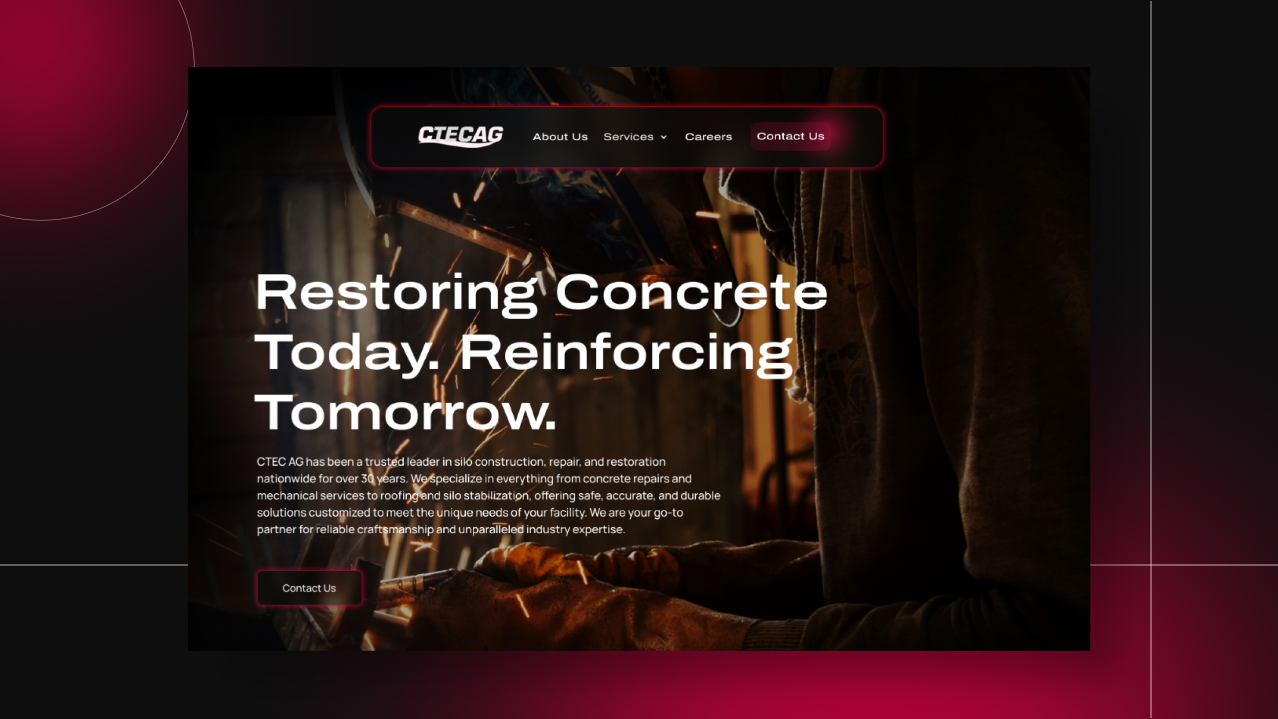
C-TEC AG
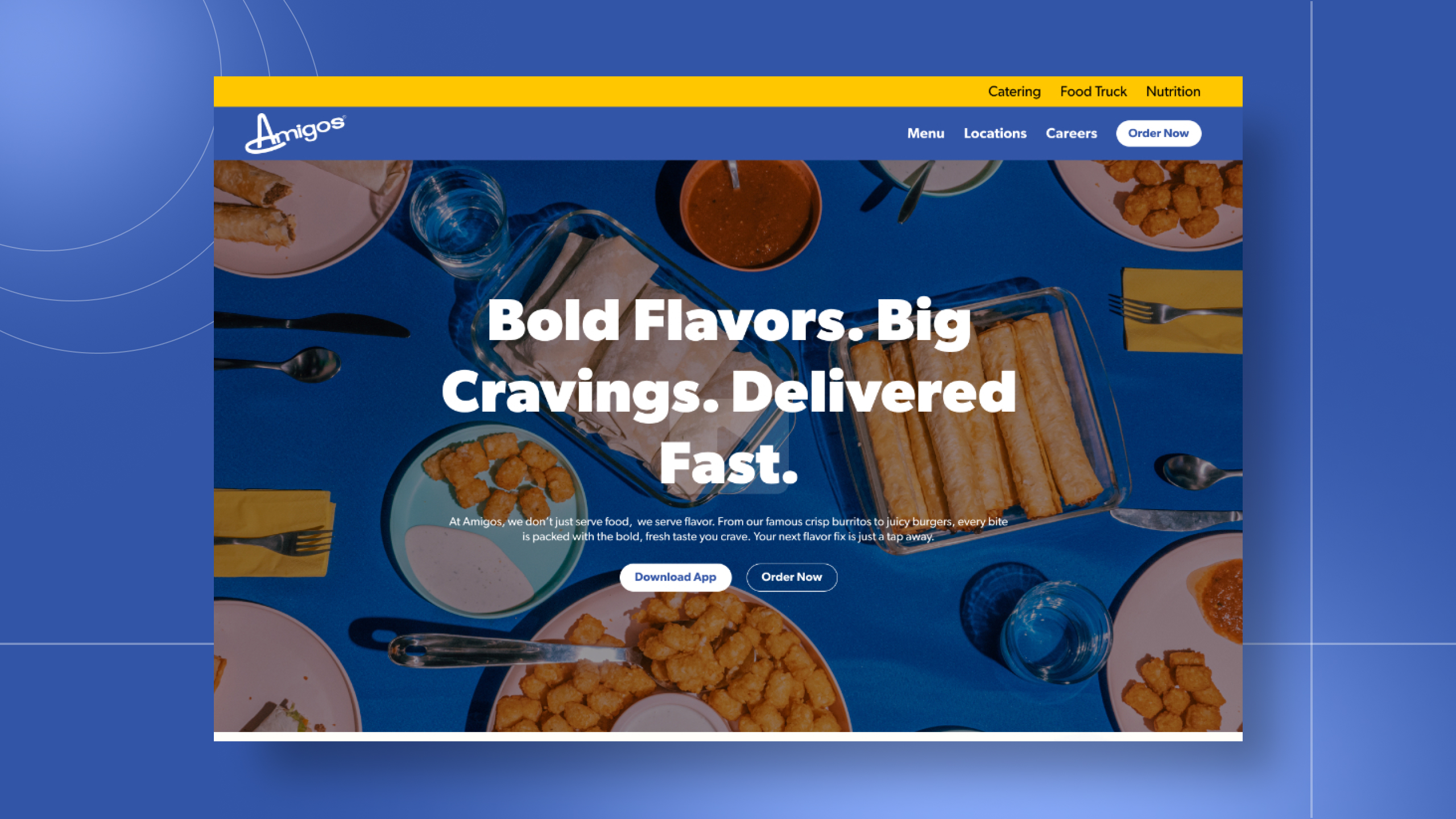
Amigos/Kings Classic
One conversation. Two ways to work together.
Tell me what you're building. I'll tell you how I can help.I'm a UI/UX designer and front-end developer with five years of agency experience, award-winning work, and a portfolio of sites that actually perform. Whether you're a hiring manager sizing up your next designer or a business owner ready to launch something better — I'd love to hear about it.