
Nebraska Farm Bureau
When the Biggest Design Decision Happens Before You Open Figma
The Nebraska Farm Bureau Federation represents more than 56,000 member families across Nebraska. It's a grassroots organization with real political clout, real legislative advocacy, real leadership programs, and a century of institutional history. When Redthread brought me onto the project in 2025, all of that equity was distributed across a website with more than 60 pages, no clear hierarchy, and a navigation structure that buried the most important actions behind three and four clicks.
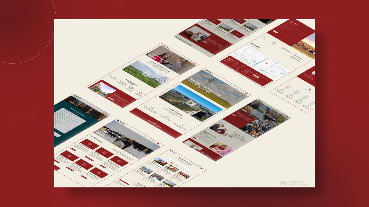
The brief sounded simple: redesign the site. The actual work was much bigger than that. Before a single pixel could be drawn, the site needed to be restructured from the ground up. That meant a full content audit, mapping 60+ existing pages against actual user goals, and making hard calls about what stayed, what got merged, and what got cut entirely.
The final architecture landed at just over 20 pages, organized under four clear pillars: Connect, Advocate, Get Involved, and Resources. That consolidation isn't just a nav change. It's the design decision that made every other design decision possible.
Designing for Farmers Who Don't Have Time to Get Lost on Your Website
The biggest challenge on this project was the one the client named first in discovery: time. The audience is farmers, ranchers, and agribusiness professionals, people whose day is already full before they ever pick up a phone. If the site made them work to find what they needed, they'd close the tab and the organization would lose a touchpoint. That reality shaped every architectural and UX choice that followed.
I designed over 20 pages of wireframes before any high-fidelity design began, mapping each page against a specific user intent: join, renew, advocate on a specific issue, access member benefits, find local events, understand the organization's work. Every page had to earn its slot. If a page couldn't answer "what does this help a member do," it got consolidated into something that could. A lot of the old site was institutional content written for the organization, not the member. The new site flips that relationship.
The other challenge was structural. Nebraska Farm Bureau isn't just one thing. It's advocacy, it's education, it's leadership development, it's member benefits, it's a foundation, it's a PAC, it's a young farmers program, it's county chapters. All of that had to live on one site without creating a parallel menu for each division. The four-pillar navigation (Connect, Advocate, Get Involved, Resources) was the solve. Each pillar is a verb, not a department, which means the nav reflects what members want to do rather than how the organization is structured internally.
Working closely with Redthread's team and NFBF's communications leads, we tested the architecture against real user scenarios before committing to it. That early-stage rigor is why the launched site feels inevitable rather than debated.
What This Project Sharpened
Take Away Scaling an information architecture for a legacy organization taught me that the best design work often happens in the wireframes, not the mockups.
Information Architecture as a Design Skill
Going from 60+ pages to just over 20 wasn't a content cut. It was a strategic rebuild. I mapped every existing page against user intent, identified overlapping or dead content, and rebuilt the sitemap around verbs (Connect, Advocate, Get Involved, Resources) rather than internal departments. This is the skill that separates a designer from a strategist, and it's now central to how I start every large project.
Wireframe First, Decorate Later
With 20+ wireframed pages approved before visual design began, the actual design phase moved faster and landed cleaner than any project I'd worked on before. Every layout choice, every component, every interaction was grounded in a structural decision that had already been tested. No rework loops. No "can we move this block up" conversations that rewrite the whole page. It's the template for how I run large site projects now.
Design Consistency at Scale
Twenty pages means twenty chances to drift. I built a component library early and forced every page layout to work within it, which meant members get a predictable experience no matter where they land. Consistency isn't just a design virtue on a site like this, it's a trust signal for an audience that values clarity and doesn't have time for surprises.
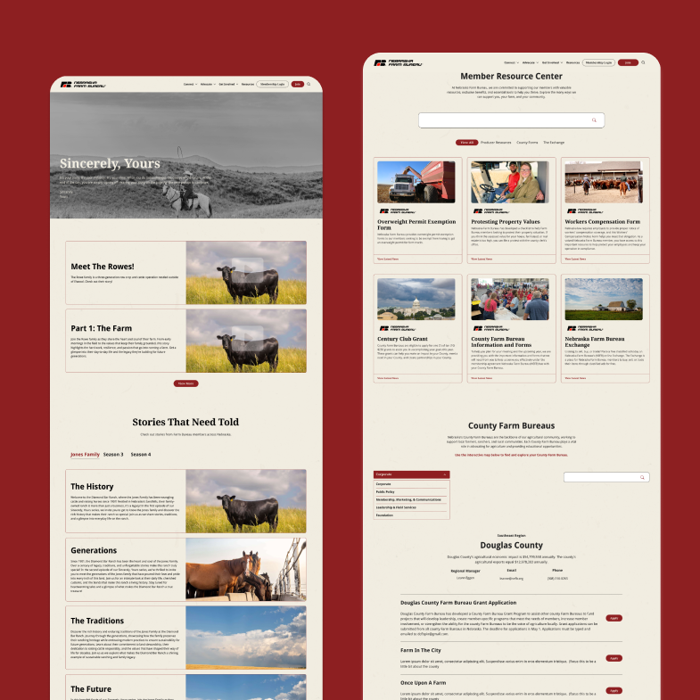
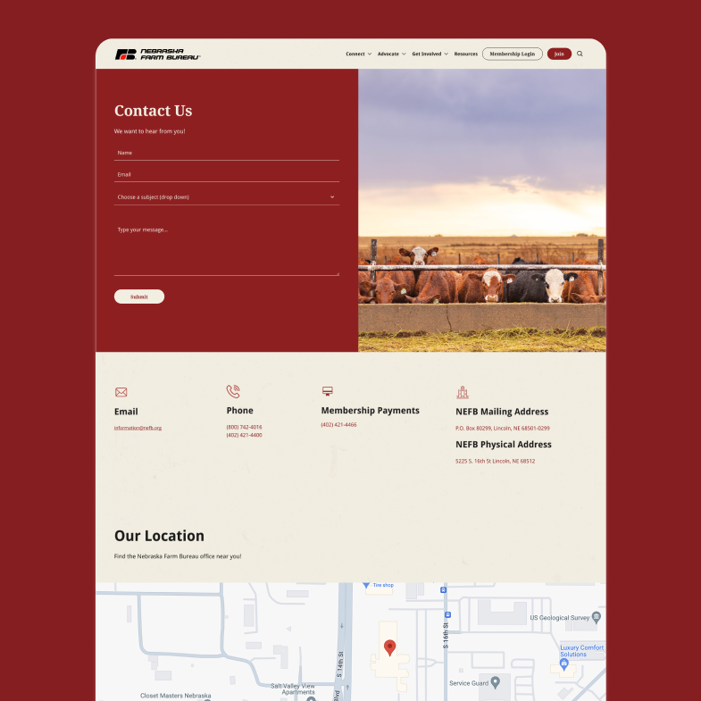
Final design
The interface became a tool that disappeared into the work itself. Clean, purposeful, and genuinely useful.
The numbers tell the story of what changed
This was the project that taught me the most important design work on a large site happens before Figma ever opens. When a client has 100 years of history, 56,000 members, and 60+ pages of content to reckon with, the job isn't to make it pretty. The job is to make it make sense. Cutting the site by two-thirds while expanding what it actually does for members is the kind of outcome I want on every large project from here. Working with the team at Redthread on an organization this deeply woven into the state of Nebraska made the stakes feel real, and the craft feel earned.
Made for Impact
Explore projects that solve problems, delight users, and drive results.
Nebraska Farm Bureau
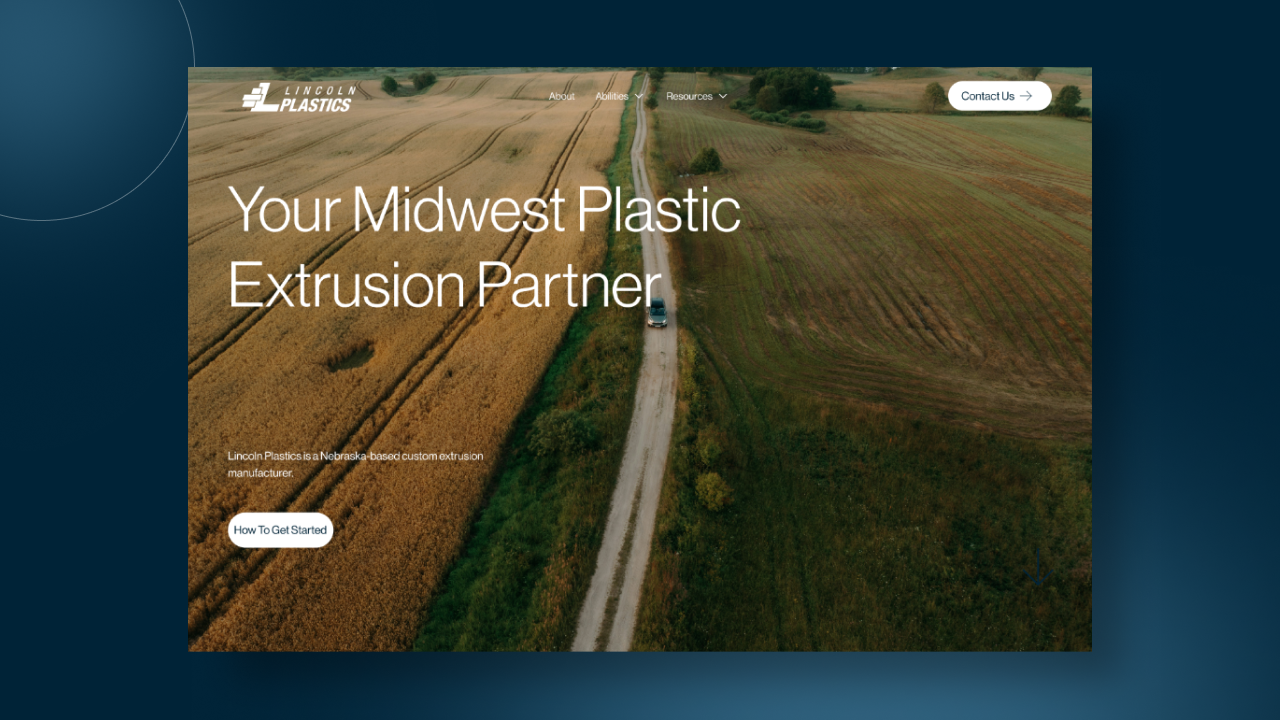
Lincoln Plastics
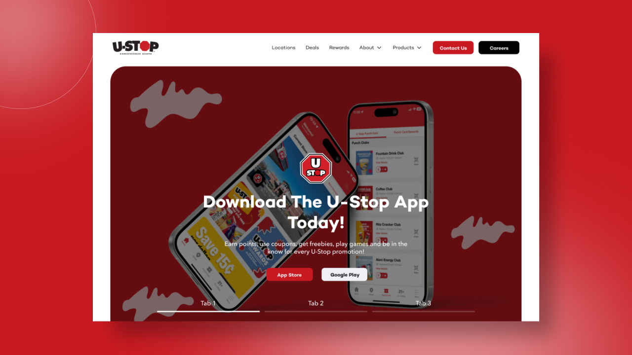
U-Stop Convenience Shop
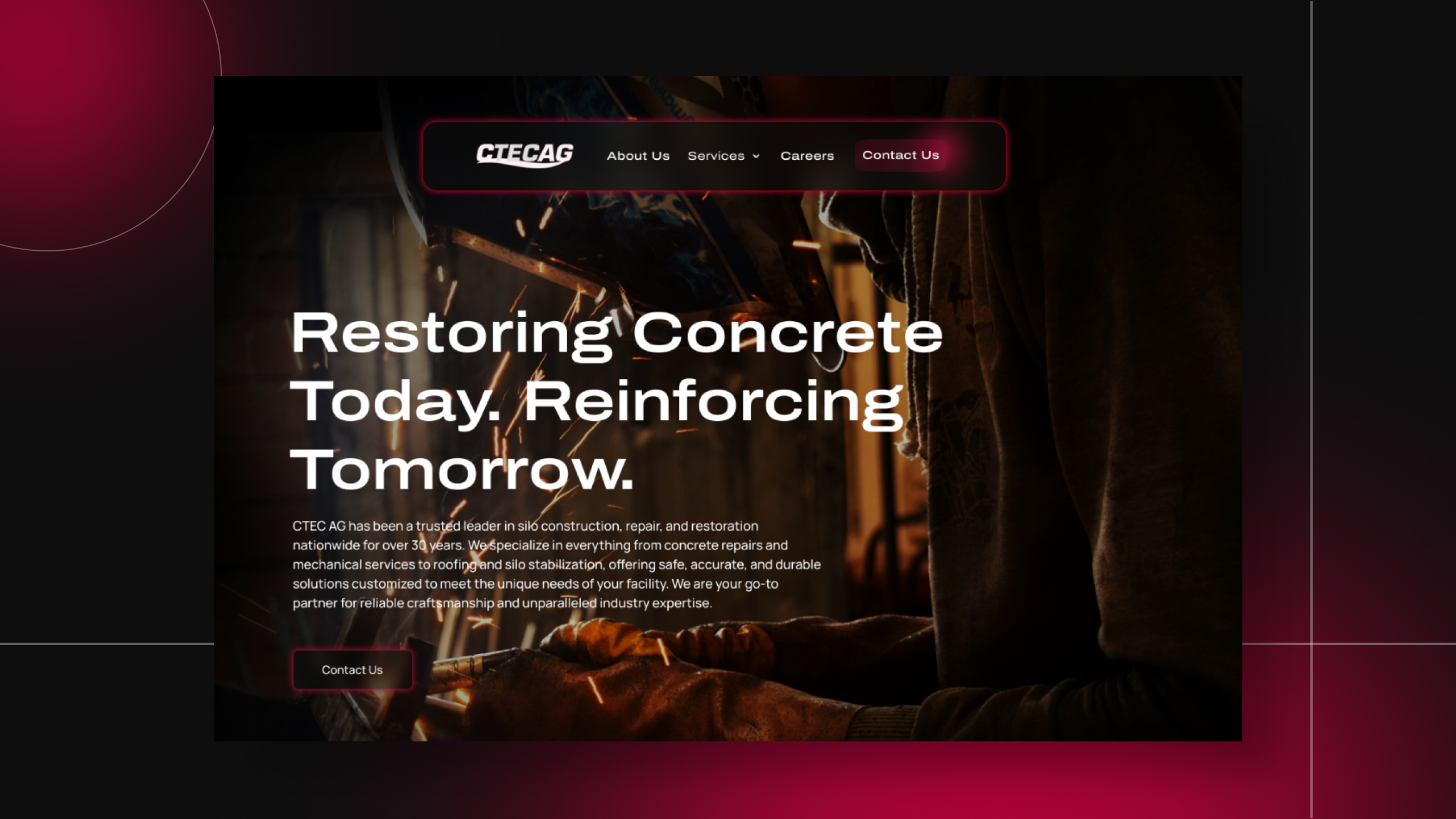
C-TEC AG
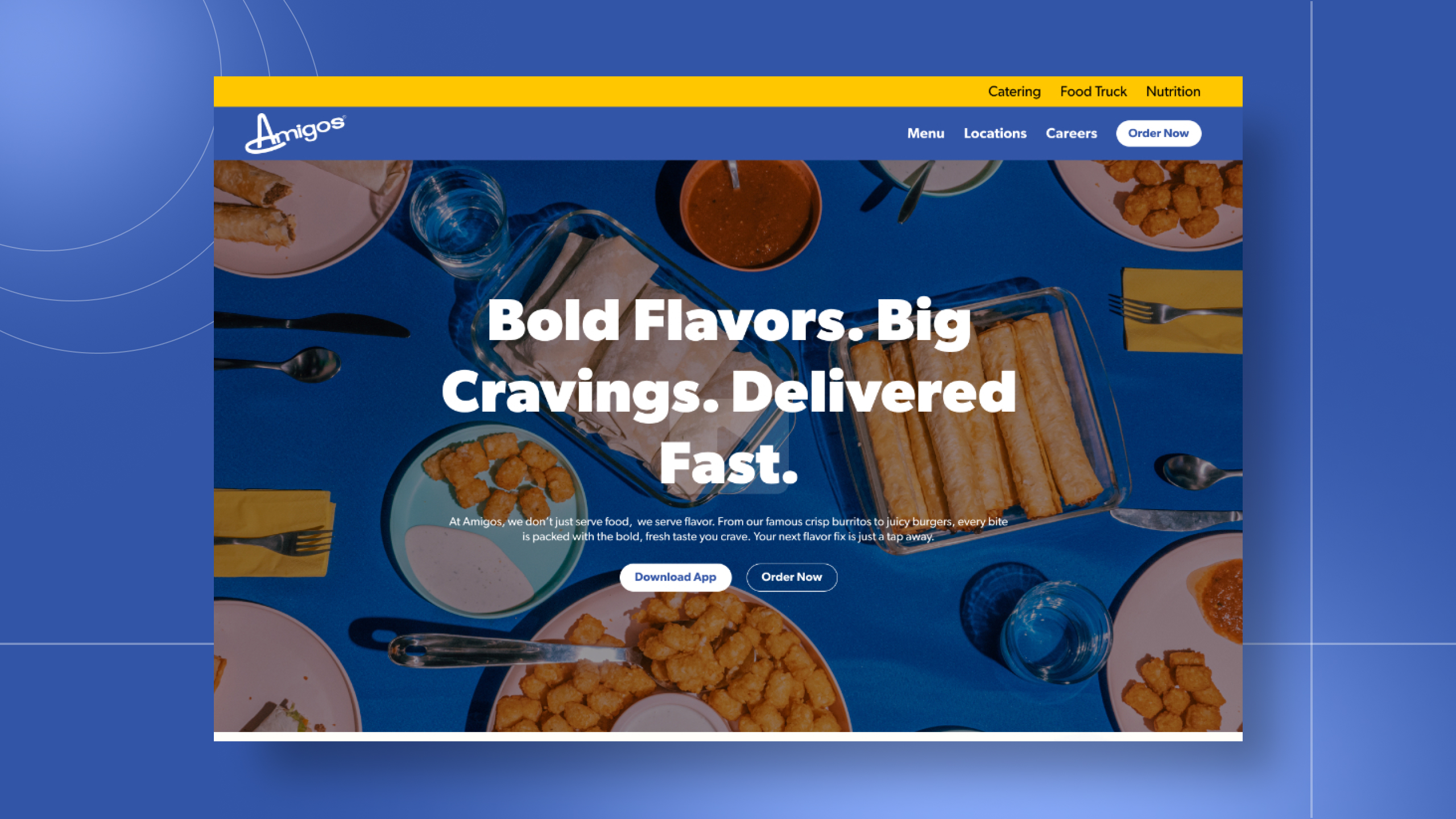
Amigos/Kings Classic
One conversation. Two ways to work together.
Tell me what you're building. I'll tell you how I can help.I'm a UI/UX designer and front-end developer with five years of agency experience, award-winning work, and a portfolio of sites that actually perform. Whether you're a hiring manager sizing up your next designer or a business owner ready to launch something better — I'd love to hear about it.