
Lincoln Plastics
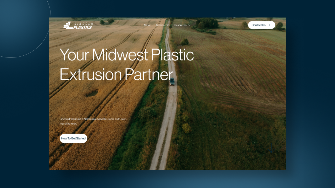

Helping a Quiet Manufacturer Step Out of Its Sister Company's Shadow
Lincoln Plastics is a Nebraska-based custom plastic extrusion manufacturer with a long history, a specialized set of capabilities (pipe and tube, flexible profiles, rigid profiles, value adds), and a customer base that spans center pivot irrigation OEMs, government contracts, national retailers like Menards, and one-off custom manufacturing clients. For years, their digital presence lived in the shadow of HTI Plastics, their sister division under the PCE family of companies. Customers couldn't tell the two apart. The old WordPress site was outdated, hard to update, and visually indistinguishable from the parent brand.
When Redthread brought me onto the project in 2025, the brief had two layers. Build Lincoln Plastics a visual identity of its own that still feels part of the family. Then build the website that proves the separation is real.
This was also a personal milestone for me. It was my first Webflow project where I stopped treating the platform as a Squarespace alternative and started designing around what Webflow actually does well. Structured content, CMS-driven capability pages, clean animations, and a site architecture that the client's internal team can actually manage. It's the project that flipped the switch on how I build everything now.
One Company, Five Audiences, and a Parent Brand Looming in the Background
The strategic challenge on Lincoln Plastics wasn't just "make a new site." It was figuring out how to talk to five different audience types on one homepage without making the site feel like a catalog.
Ag OEMs (Valley, Lindsay, Reinke, T/L) need to see irrigation pipe credibility fast. Retailers like Menards need to understand the Flexiduct product line and ordering logistics. Custom manufacturing clients (machinery, fluid tank indicators, specialty profiles) need to trust that a small Nebraska shop can actually handle their spec. Government buyers need compliance signals like ISO 9001 certification up front. And then there's the general curious visitor who just searched "custom plastic tube manufacturer" and needs to be hand-held from "what is extrusion" to "how do I request a quote."
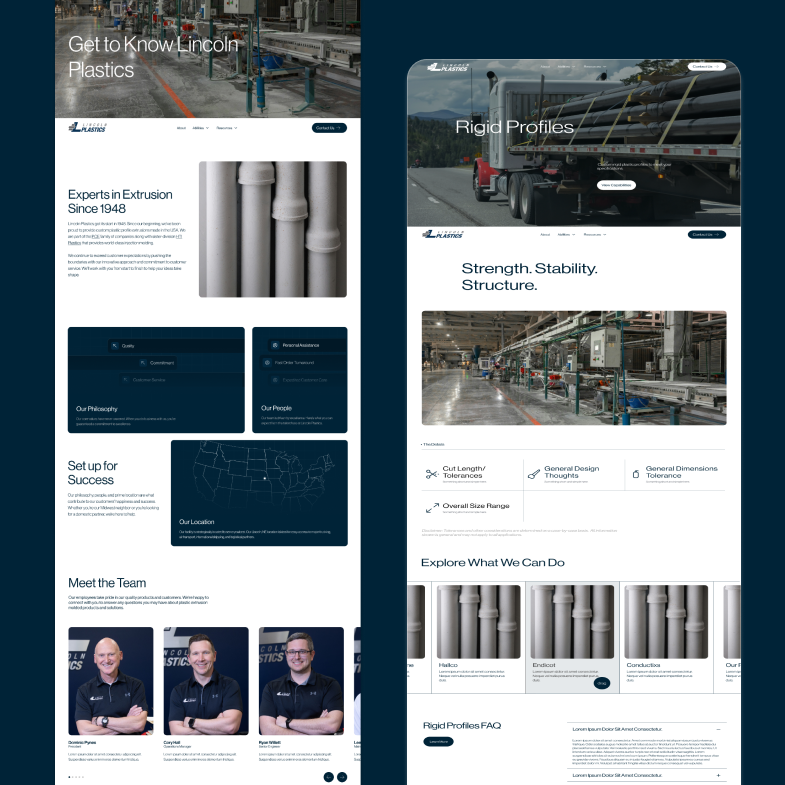
The solve was a capabilities-first architecture. Instead of organizing the site around industries (which would have forced us to repeat content endlessly), I organized it around what Lincoln Plastics actually makes: Pipe & Tube, Flexible Profiles, Rigid Profiles, Value Adds. Each capability page does the heavy lifting of explaining process, materials, and example applications. The homepage became a routing layer that sends each audience to their relevant capability.
The second challenge was the brand itself. Lincoln Plastics needed to feel connected to PCE and HTI without being interchangeable. I developed a system built around the trapezoidal shapes in the logo (echoing the extrusion process itself), a restrained navy-and-grey palette that reads as industrial and trustworthy, and a typographic rhythm that pairs precision with approachability. The shapes got woven into the site as decorative elements, video backgrounds, and section dividers so the brand feels consistent without being repetitive.
What This Project Sharpened
My first fully strategic Webflow build, from brand discovery through launch and live performance.
Brand and Web Work Better When Built Together
Because I was designing the brand identity and the website in parallel, every visual decision could be stress-tested against real content, real layouts, and real user journeys. No handoff gaps, no "does this color actually work on a button" surprises. I want every future project to work this way when the scope allows.
Architecture Over Aesthetics
With five audiences and four capability categories, the site would have collapsed under its own weight if I'd led with visuals. I started with sitemap, user flows, and wireframes, then layered design on top. The result is a site that works structurally first, which is why paid media converts on it and organic search keeps climbing.
Webflow as a Real Design Tool
Before Lincoln Plastics, I thought of Webflow as a limitation. This was the project that taught me it's a capability. Structured CMS fields, reusable components, clean animation layers, and a CMS backend the internal team can actually manage without breaking things. It's now my default recommendation for mid-market B2B sites.
Final design
The interface became a tool that disappeared into the work itself. Clean, purposeful, and genuinely useful.
The numbers tell the story of what changed
This was the project where Webflow stopped being a platform I used and became a platform I designed around. Building a brand identity and a website in parallel, for a manufacturer with five distinct audiences and a parent company breathing down the visual neck, taught me that the best B2B design work happens when architecture, brand, and CMS are all thought about at once. The team at Redthread gave me the room to lead both the brand and the build, and seeing it hit 20K active users in its first year with paid media working on it daily confirmed it.
Made for Impact
Explore projects that solve problems, delight users, and drive results.
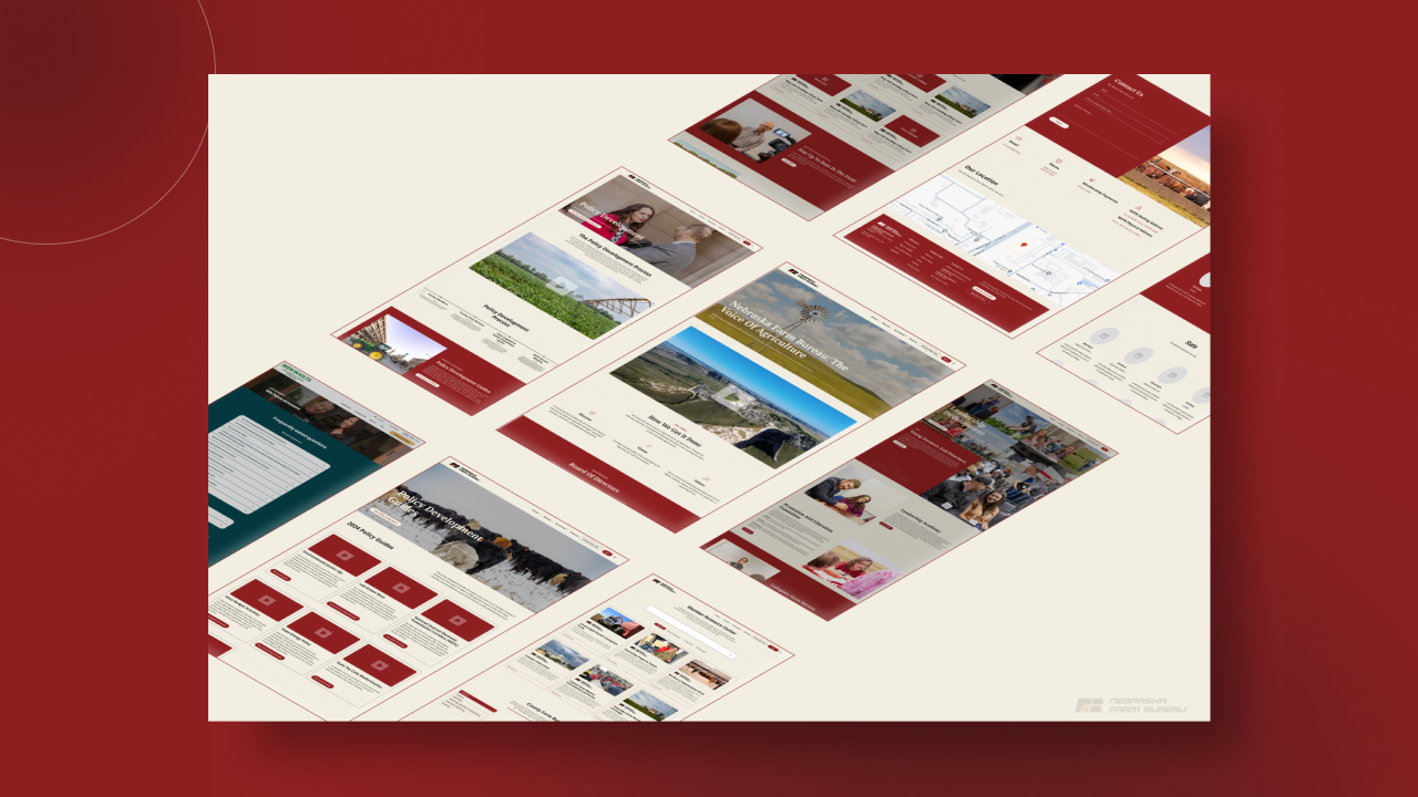
Nebraska Farm Bureau
Lincoln Plastics
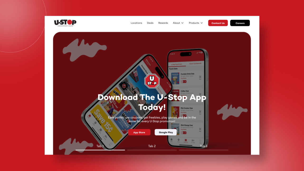
U-Stop Convenience Shop
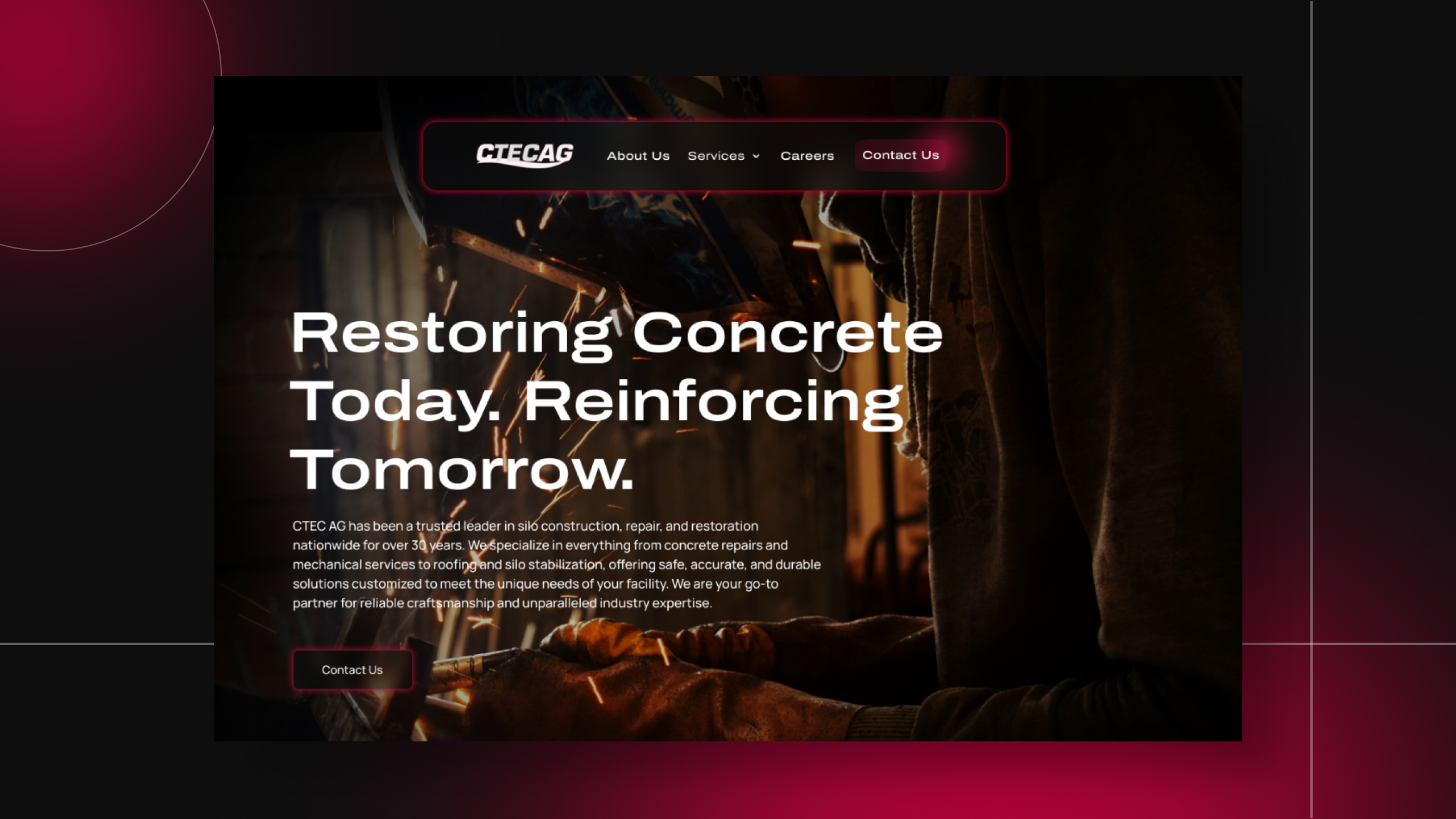
C-TEC AG
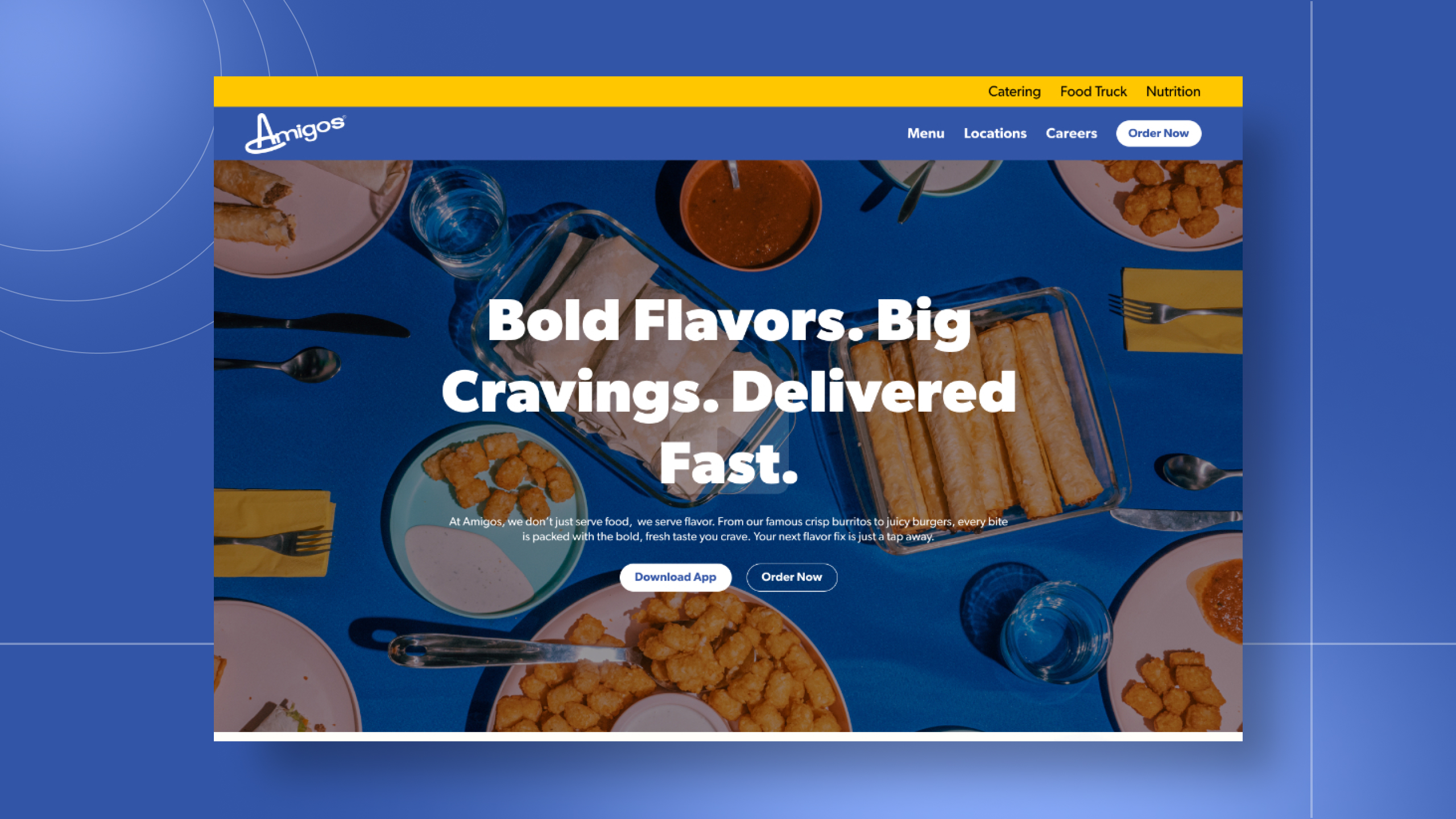
Amigos/Kings Classic
One conversation. Two ways to work together.
Tell me what you're building. I'll tell you how I can help.I'm a UI/UX designer and front-end developer with five years of agency experience, award-winning work, and a portfolio of sites that actually perform. Whether you're a hiring manager sizing up your next designer or a business owner ready to launch something better — I'd love to hear about it.