
C-TEC AG
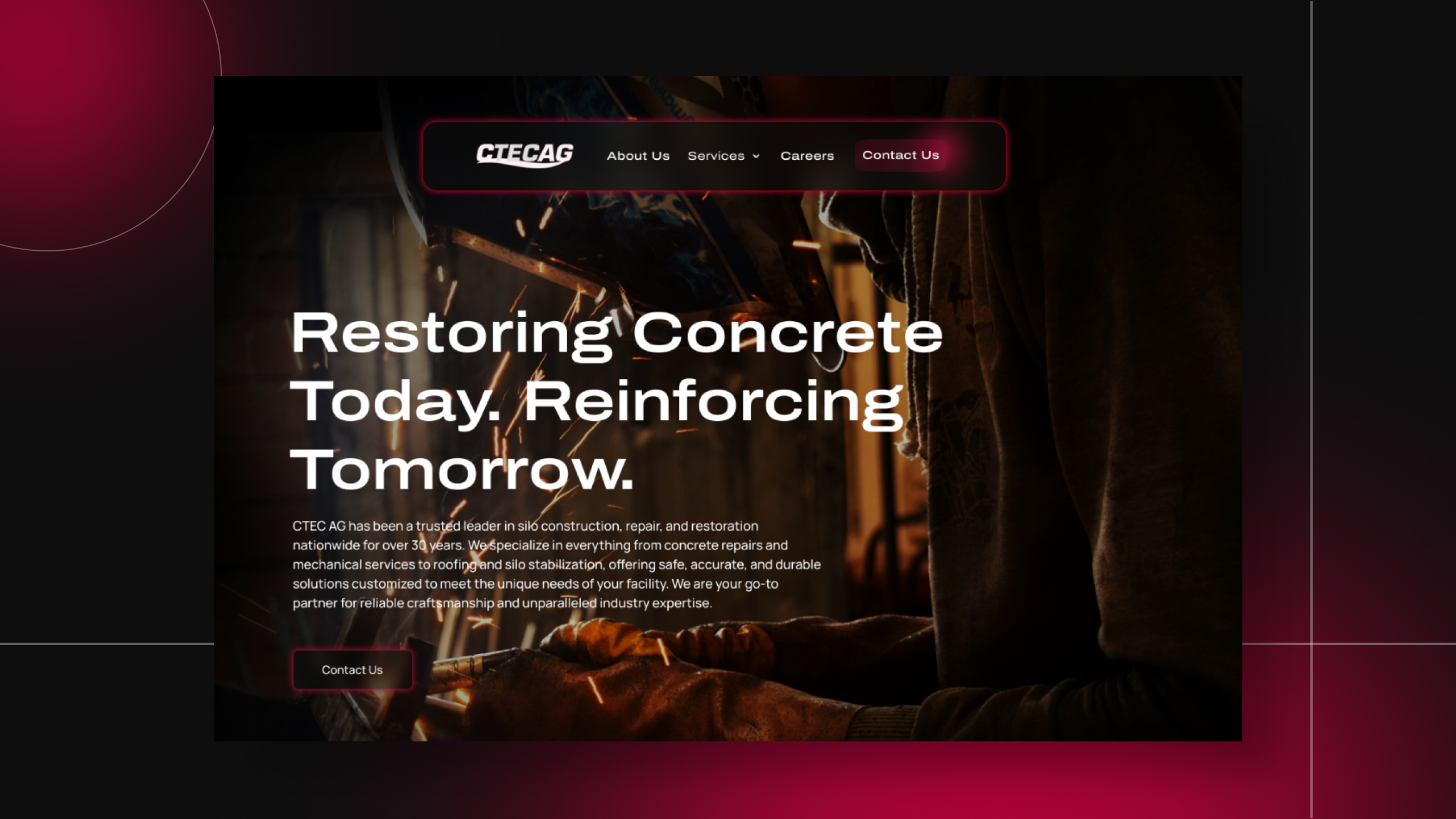
Translating Industrial Expertise Into a Digital-First Brand
C-TEC AG has spent 30+ years as a trusted name in silo construction, repair, and restoration. But when I started on this project at Redthread, the existing site didn't reflect the weight of that reputation. It was a dated, blue-and-red template layout with stock photography, testimonial bubbles, and a homepage that buried the actual service paths under decorative noise.
The goal was to craft a brand experience that communicated authority and craftsmanship to the facility managers, plant operators, and procurement teams who actually sign off on six and seven-figure contracts.
This also marked a personal first for me. My first fully dark-mode website. That constraint turned out to be the creative unlock of the year. Working in a dark palette forced me to rethink hierarchy, contrast, and restraint from the ground up. Once I tuned into the client's objective of precision, durability, and weight, every design decision started falling into place. The site needed to feel as rigorous and dependable as the work itself, while still guiding visitors toward the two paths that matter most. Construction and Mechanical Services.
Designing for a Buyer Who Doesn't Scroll for Fun
The trickiest part of this project wasn't visual. It was structural. C-TEC offers two distinct service lines, concrete restoration and mechanical services, with almost no overlap in audience, yet they live under one brand. Early wireframes tried to blend the two, and it immediately muddied the decision path.
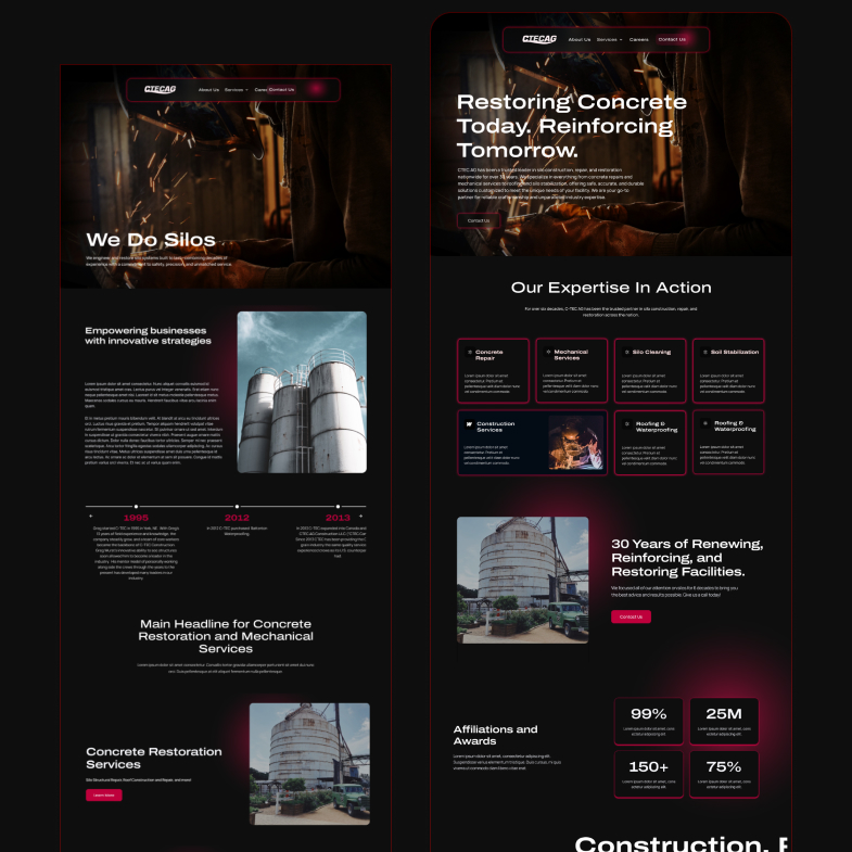
The fix was committing to a dual-track architecture. Parallel CTAs, parallel service grids, and a homepage that lets a plant manager self-identify within the first scroll. On top of that, the content itself had to walk a line between technical credibility, shotcrete, gunite, soil stabilization, foam injection, and readability for someone who isn't buried in those terms every day.
The dark-mode execution brought its own layer of complexity. Every typography choice, every red accent, every card border had to be pressure-tested for contrast and accessibility. I spent real time at the intersection of "does this feel industrial enough" and "can a procurement officer actually read it on a mid-day job site." Collaborating closely with Redthread's project leads, we pushed through multiple rounds until every screen cleared both bars.
What This Project Sharpened
A creative breakthrough in dark-mode design, paired with the structural discipline B2B demands.
Dark-Mode as a Design Discipline
This was my first fully dark-mode build, and it reshaped how I think about hierarchy. Without the fallback of white space, every element has to earn its place through contrast, weight, and spacing. It became less about decoration and more about engineering attention. It's now a range I can bring to any future client who wants their brand to feel premium and intentional.
Dual-Path Architecture
Designed the homepage and service pages around two clear conversion tracks, Construction and Mechanical, so every visitor lands on a path that matches their actual need within seconds, not screens. The architecture now doubles as a sales tool. The site itself qualifies leads before the form is ever submitted.
CMS-First Thinking
Partnered with Redthread's team to build a Work collection in Webflow with modular fields including project overviews, challenge sections, stats, galleries, and take-away quotes, so C-TEC's marketing team can publish new case studies and service updates without touching the design system or queuing up developer time.
Final design
The interface became a tool that disappeared into the work itself. Clean, purposeful, and genuinely useful.
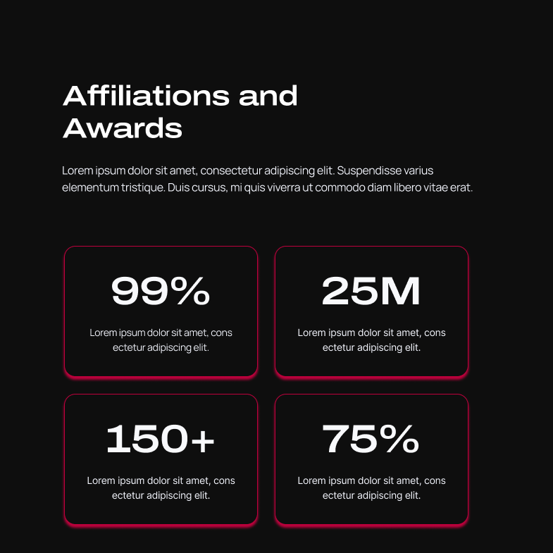
The numbers tell the story of what changed
This was the project where dark mode stopped being a style choice for me and became a design discipline. When you strip away the safety net of a white canvas, you're forced to design with intention on every pixel. Working with the team at Redthread on a client whose work is genuinely impressive, silos, industrial restoration, nationwide scale, made the creative flow easier than any project I'd taken on before. The objective was clear, the brand was real, and the execution got to match both.
Made for Impact
Explore projects that solve problems, delight users, and drive results.
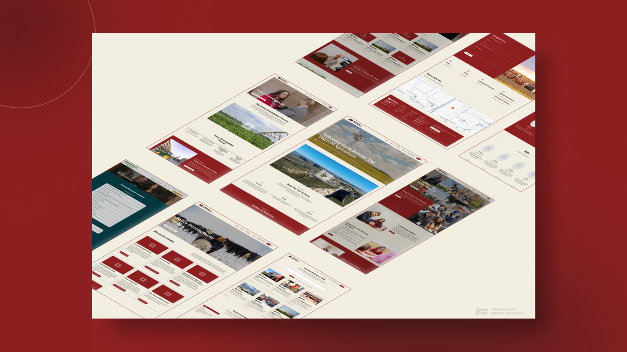
Nebraska Farm Bureau
Lincoln Plastics
U-Stop Convenience Shop
C-TEC AG
Amigos/Kings Classic
One conversation. Two ways to work together.
Tell me what you're building. I'll tell you how I can help.I'm a UI/UX designer and front-end developer with five years of agency experience, award-winning work, and a portfolio of sites that actually perform. Whether you're a hiring manager sizing up your next designer or a business owner ready to launch something better — I'd love to hear about it.